

Live in the WOOOOOOOOO
What do GenZ - the best value seekers behave in their natural habitat? They constantly look for great deals. They like the triumphant feeling of outsmarting the situation. Once they seal the deal, they enjoy bragging about it within their close group of friends. You know what, all these moments have one mutual pattern:
THE WOOOOOOOO
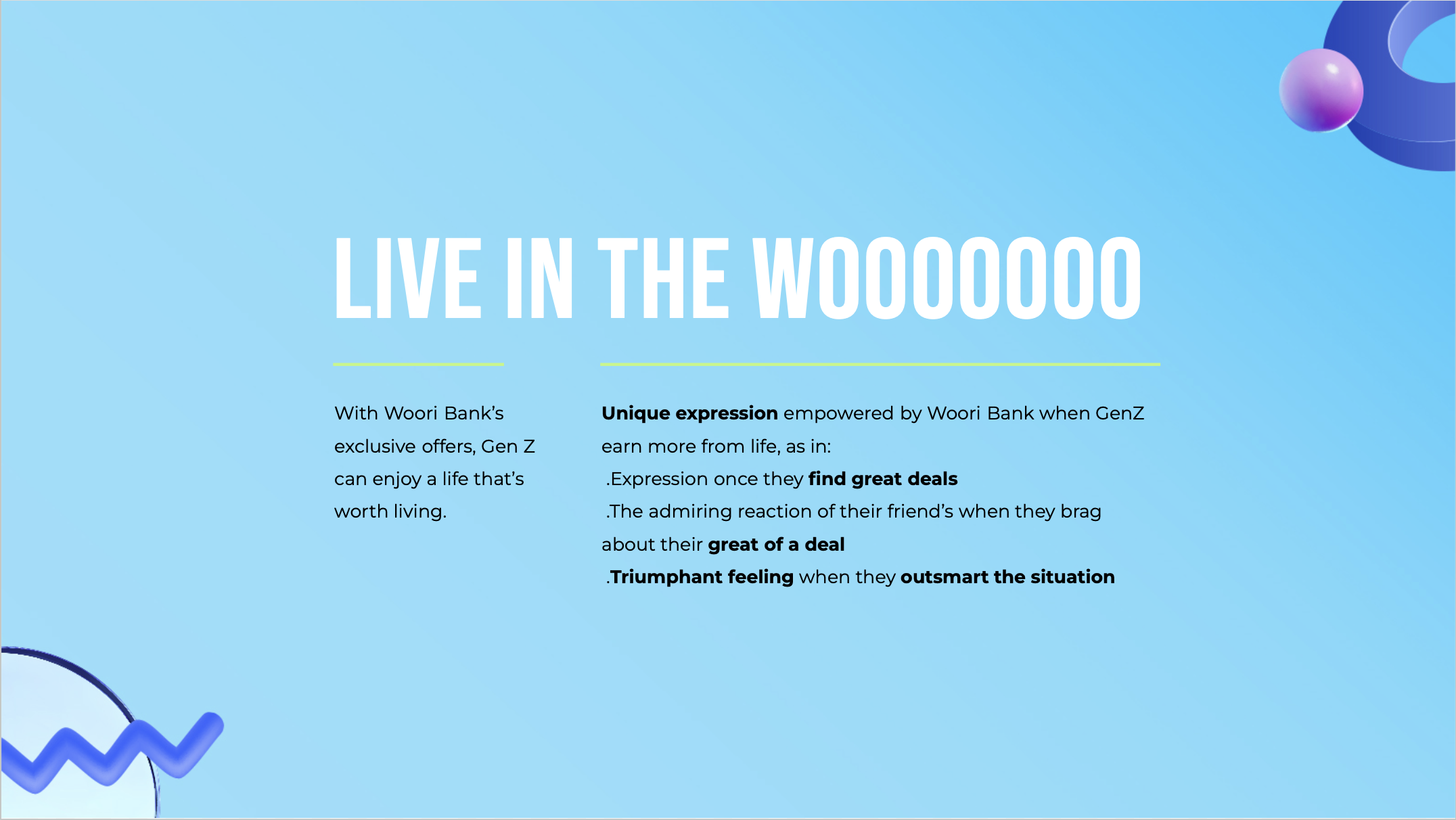
Brand role: With Woori Bank’s exclusive offers, Gen Z can enjoy a life that’s worth living.
Side note: Woori is pronounced “Uri,” meaning “ours” in Korean. However, it’s widely mispronounce as “worry", which add a negative effect to the brand.
So in this campaign, we not only increase brand’s relevancy to new target audience Vietnamese Gen Z, but also educate Vietnamese how to pronounce Woori in a correct way, associate the brand name with something optimistic: the woo feeling.
CD: CHI NGUYEN LE
acd: MINH LE
ART DIRECTOR: CHI DO, WONGI HONG
COPYWRITER: UYEN Quach
designer: huden, ha dung
the CONCEPT
TRIGGER CUE
We leverage WON app’s symbol as a signature trigger cue, signaling the fascinating moment the WOOOO life starts with Woori Bank. This consistent iconic cue will help to spread awareness about Woori Bank’s identity across different assets.

Before WOORI
Life starts maximize with Woori Bank

Unique expression empowered by Woori Bank when GenZ earn more from life
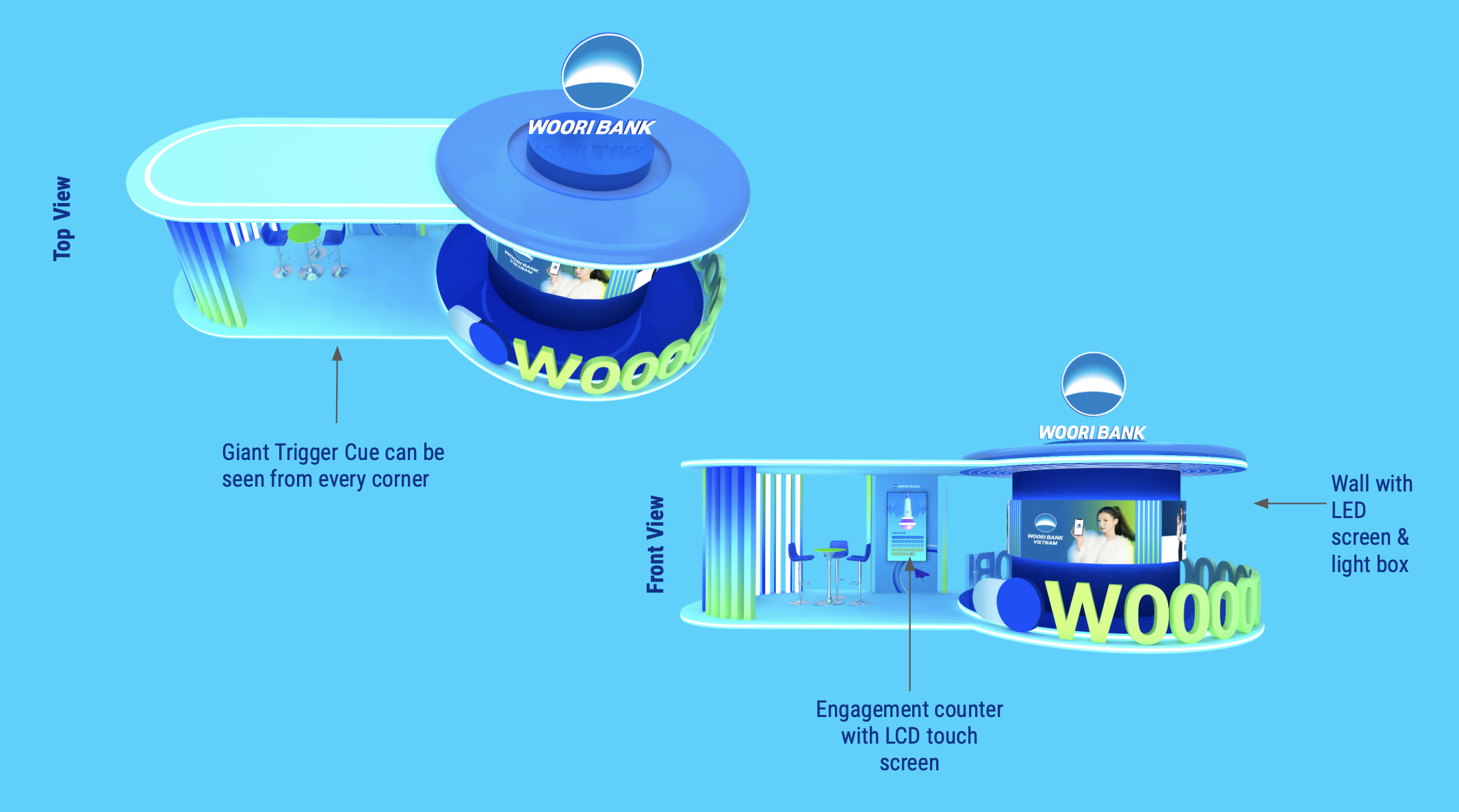
PUBLIC STUNT
We came up with an idea for a key offline activity to hook users’ attention with a stunning visual icon & make them WOOOO. The more they WOOOO - the more they earn with Woori Bank.

WOO IT, EARN IT.
We plan to set up a booth at public space that hooks attentions:
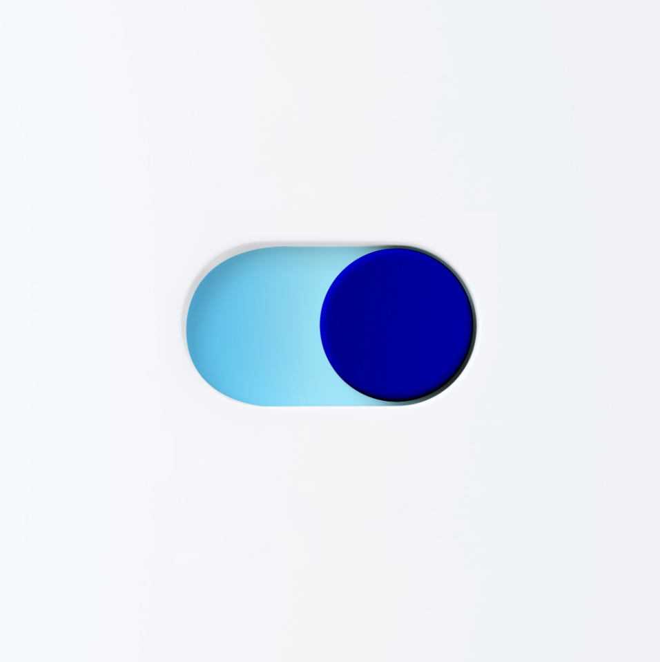
• From above, it looks like a giant WON app toggle
• The side will have an interactive screen
• There will be games for user to interact, PG to help register for the app and receive incentives

WOO LÂU, QUÀ LỚN.
The longer & louder participant WOOOO to the screen, the bigger deal they can get.
This screen will allow people to interact & tap to select an “O”. The reward will appear according to their selected choice.
To get rewards, users need to download WON App with the help of on-ground PG.
With the help of event team, we refine the booth design to be more cost effective and user friendly


The idea came to life and receives thousand interests.

For those who couldn’t join onsite, we create an engagement on TikTok for gen Z anywhere in Vietnam to participate to woo more, earn more
KEY VISUAL
The original idea is to shift gen Z to the Woori-verse. So we proposed a few direction that is trendy and convey the mood.

It started off with a draft that has graphic elements flying up with the character, representing promotions and benefits Woori offers.
The character, wearing trendy clothes, staying comfy on top of the Woo
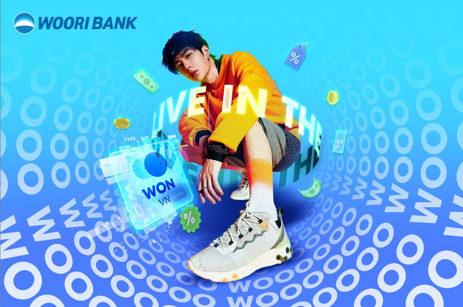
Applying kinetic typography, we shift gen z to a world that is more techy.

Coming back to the hidden idea of the campaign, which is educating customers to pronounce the brand name correctly, we came up with the final KV.
6s hijack bumper
Using Vogon ad, based on GenZ’s interest: dining, traveling, gaming,...
We create a series of contextual 6s that feature a variety of WOOOO moments gen Z can enjoy with Woori, showcase them how their daily activities can be enjoyed in a much more fascinating way with Woori Bank. Thus to trigger them to download app & open new account.
We pair up 4 brands feature with gen Z passion points to increase relevancy.
Entrepreneur - 11% saving | Food - QR Pay | Music - Shake action on App | Game - Trade W point
THE STORYBOARDS:


THE MOOD BOARD:

FINAL 6-SECONDER SERIES
CAMPAIGN visual guideline
sneak peek
Design Mood Board
The "WOO" expression is our visual cue; hence, the design should leverage its funky and interesting mood. The visuals need to interact with the bold copy to create an impression. In case of using a photo, the typography should also interact with the details and be skewed based on the photo's perspective.

Topic: Card
Inspired by the moodboard, we want the typo and the card to interact with each other, creating depth in design. The design can be simple, or looks interesting with a touch of modern elements, such as glowing neon, glitching details or digital file look-a-like
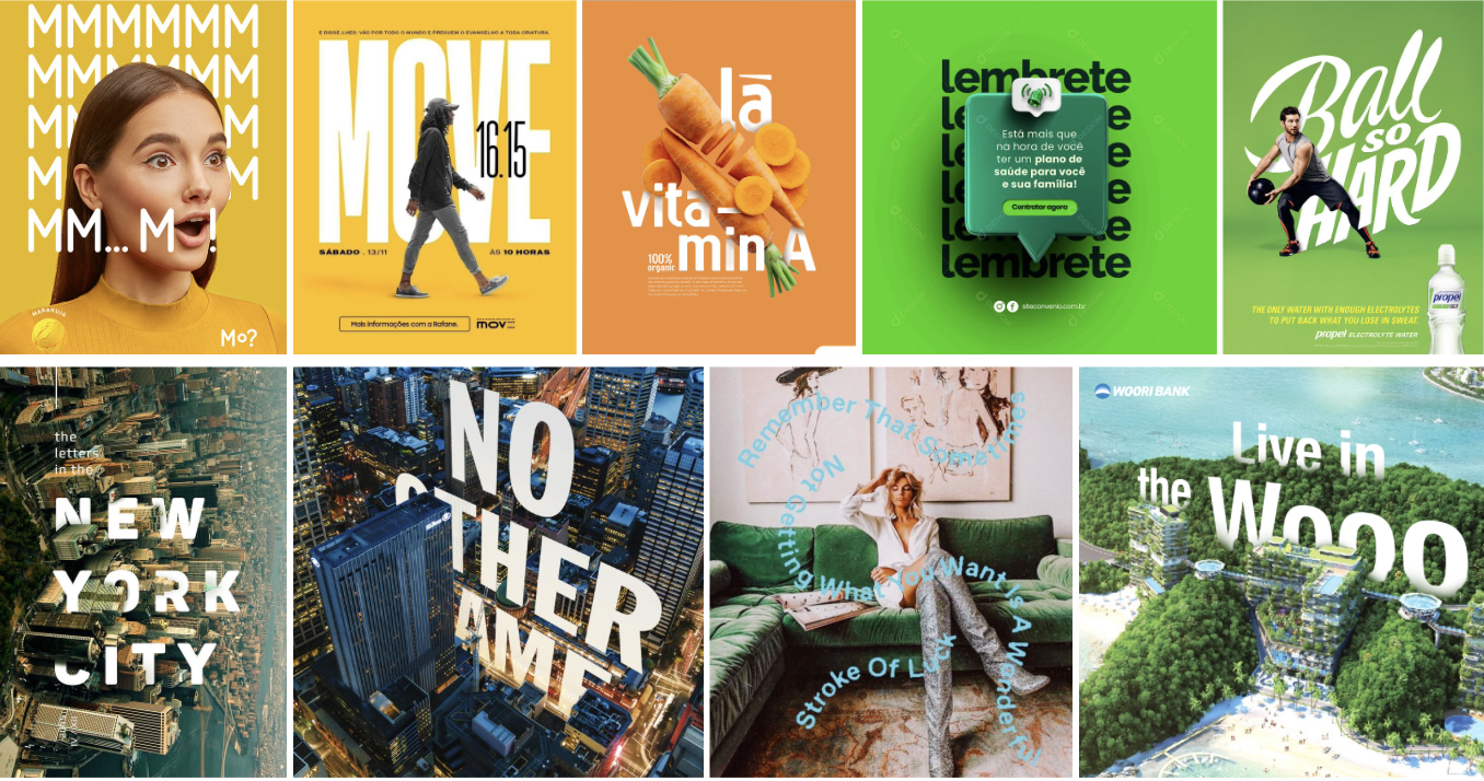
Topic: WON app feature
To express the modern and digital spirit, we’re utilizing button element that can be seen in app and web design.
Furthermore, for the social content to look attractive, especially to gen Z, we apply vector and emoji design as supporting elements, adding hologram effect to connect with technology.

Topic: Study Abroad Deposit
This content speaks directly to gen Z, so we’re borrowing Hallyu, Manhwa and Y2K culture in the design.
For post that needs to communicate a certain message, we use multiple frames with 2D elements to create a feel of reading Manhwa. This help designers work with a lot of information in without making the content messy. For post that simply for event photos, we use digital windows like what you see on a computer to have a fun twist in the post instead of just normal frame.
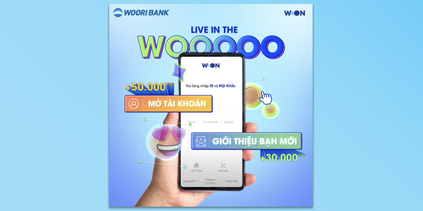
Topic: Loan
Using Loan service in Woori opens up new opportunity for customers to “live in their Woo.” We’re using a door connects between limbo world = their world before Woori, to the dream world that they are able to achieve thanks to Woori. The visual inside the circle or the size of the circle can be altered depends on content.

Topic: Insurance
Utilizing brand’s toggle, we extent it into a circle that protects user, expressing spirit of safety and sustainability, helping customers feel rest assured with Woori’s insurance partnership.

Topic: Savings
Saving with Woori bank brings customers growth and richness. We’re borrowing a visual of stacking coins plus Woo visual cue to represent the fast growth in savings, which would help customers to picture the potential with Woori bank. This visual can have different variation by changing angle, style of the coins or different products placed on the coins. These elements need to be used according to the content.